Research
I initially wanted to do an Italian red wine, but decided on a different region that is less known for its wine.
I thought about Japanese wines so I began some research and discovered that Japan mostly imports its grape wine. Not to say there isn't wine production going on there. Yamanashi Prefecture is known for its vineyards and in Koshu they have a grape named after it. So I chose to do a Koshu wine. This grape produces a fruity, fresh taste with a pale color.
There area of Koshu is a valley surrounded by mountain ranges and lakes. From a distance stands the tallest peak in Japan, Mt. Fuji. Keeping this in mind, I integrated this information with my original concept of three moons. Although I still haven't settled upon several key elements, I believe I have a very good starting point to my package design.
After doing further research, I discovered that there is a folklore about the moon in many cultures.
Word lists
Wine:
grapes
vineyards
hills
open plains/ fields
drink
social gathering
events/ parties
zifandel
cabarnet
pinot noir
tasting
berries
grapevine
trellis
dry
fruity
elegant
French/France
California
New Zealand
barrels
corks
bottles
crates
cheese
crackers
cheescake
expensive
wine press
glasses
purple/red color
green/ yellow color
Red
White
Vineyard:
vines
grapes
trellis
fields
dry
hardwork
irrigation
hills
chateaus
plains
tastings
berries
cheese
crackers
winepress
rows and rows
open space
Grapes:
vines
vineyards
juicy
round
juice
juicebox
snack
raisins
The Raisins show
no pits/ seedless
purple
green
tasty
round
Moon:
round
bright
moon phases
reflective
illuminating
moon craters
man on the moon
outer space
space ship
astronauts
Initial Thought Process (Brainstorming)
Before I settled upon a location I was doing some general idea brainstorming. There were so many possible routes to pursue. That's when I started my word lists to help focus my attention.
Mood Board

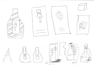
Sketches
After I read about the folklore called the Moon Rabbit, I began to pursue some ideas that would incorporate that imagery.
I kept coming back to the idea of multiple moons and Mt. Fuji.
Here I was brainstorming some box ideas. I had several ideas that involved a die cut shape that would allow the bottle to be seen.
I also had a more complex box idea that had a box that function more as a handle/carrying case in the shape of a crescent moon.
One idea involved a concave concept that would function as a grip and house a fractal moon pattern.
After visiting the store, I saw a package of small wine bottles in a box. I thought this would apply better to my saké concept as the average "on-the-go" servings are the same size, about 180ML.
I then did some sketches based off of this idea.
I really wanted to implement a fractal pattern in my design. During my attempts to create it, I realized that it wasn't the look I was going for. I then tried a mixture of concepts. After further thinking, I decided to take a more elegant/modern route.
Design Process
Label Design
I knew that I wanted to have a band that extended off of the main label and wrapped over the top of the bottle.
I also changed the color palette from reds to blues. My choice of blues changed throughout the design process, although sometimes subtly.
I started to deconstruct my design and simplify it.
As I began working on my box design, it led to changes in my label design as well.
Box Design
Originally for my box design I had a moon surface texture on the entirety of it. That's when I realized it was too much and wanted to make it simpler and more elegant. I made a blue/purple gradient. I was going to use a satin paper so that the box would have a sleek sheen to it, but was unsuccessful in finding the materials necessary.
I then switched gears and went back to my original idea of a moon surface texture.
I also had planned on having the moon image extend from the box design in a die cut shape. While I really liked this idea, the image felt like too much.
 I tried changing the shape and was pleased with the result.
However, after getting some feedback it felt too redundant to have a moon image on a textured image. Given that the textured image resembled the moon. So for the final image I went with a basic transparent color block.
Final Layouts
For the final product I used a combination of printed paper and sticker paper to create my bottle labels and 90lb. card stock for the box construction.
Final Product Images


No comments:
Post a Comment