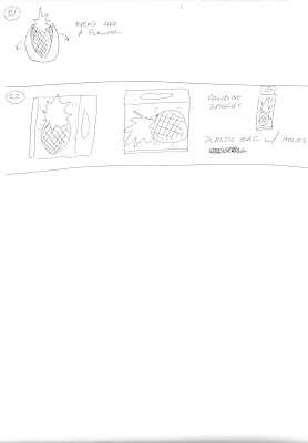
How to package a pineapple? Most fruits lack basic packaging and instead rely on simple hang tags or stickers.
Wordlists
Pineapple:
fruit
sweet
juicy
tropical
prickly skin
spiky hair (top)
Dole (Co.)
flavorful
upside down cake
fruit cocktails
rings
juice
rings with cherries
ham
Sponge Bob
plants/ not trees
yellow/ orange/ vibrant
Florida/ Central America
snack
snack/ fruitbowl
fibrous texture
grid pattern
looks like spiky monster
tough/ awkward to handle
kids food/ snacks
"on-the-go" snack
pinecones
apples
lines and dots
checkerboard
connect-the-dots
textiles
wallpaper design
tropical shirt/ Hawaii
football shape
vacation "feel"
pina colada
mixed/ frozen drinks
symbol of wealth in history
spider plant
Research
The first thing that came to mind in terms of location of pineapples was the Dole Company in Hawaii. While there are a wide range of imported pineapples the primary supplier is Dole.
After researching pineapples, I now know why they (and most fruit) are packaged using stickers or hang tags. In order to insure proper ventilation and prevention of mold and sores great care must be taken to extend the life of the fruit. Even during transportation thought has gone into the sustainability of the product.
Pineapples must be shipped upright and with proper ventilation. They are often packed standing upright in corrugated board cartons, crates, and fruit crates. These cartons and crates have adequate ventilation holes and plastic padding on inside.
Further exploration of the fruit reveals many uses and a variety of methods of consumption. For instance, the leaves of the pineapple are used to produce textile fiber called pina, as well as wallpaper.
And the meat of the fruit can be eaten raw, cooked, juiced, or preserved.
Key information to keep in mind during the design process is the sustainability of the product, as well as government mandated product information. All produce must have a product sticker that states the country of origin as well as a UPC or PLU code.
Inspirational Images
 |
| Image Source: http://freenology.com/pineapple-a-healthy-fruit-benefits-and-disadvantage-5169 |
 |
| Image Source: http://www.21food.com/products/fresh-pineapple-471579.html |
Sketches
When I saw the image for the large hang tag, I decided to do something similar. Ideally, I would have liked to design a box to house it, but after my initial research I discovered this would not be realistic due to the nature of the fruit.
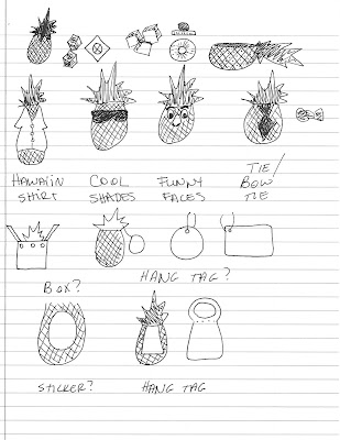
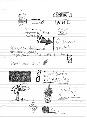
Thinking back to my experiences with pineapples I realized that I never cared for them do to their appearance. They seem prickly and hard to handle and downright terrifying to a child (at least this child). So I thought of ways to dress up a pineapple to appeal more to children as well as a special way to carry them. With this in mind I came up with the idea of a hang tag that doubles as a handle.
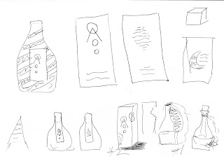
I started with some sketches of the fruit itself and the different shapes and forms it can appear. Then I began to dress it up with some silly items, because, frankly the pineapple is a silly looking fruit.
I really liked the idea of creating funny or silly faces as the main feature of my tag. The pineapple is the basic shape of a head and spiky leaves resembles hair (in an extreme fashion) so it's not that big of a leap to change it into a face. By making the tag detachable in some fashion, a whole line of funny faces could be made similarly to collector cards. This would appeal heavily to kids as well as provide a conversation starter for adult parties/venues.
I also had a few ideas about playing off of the texture and textile nature of the pineapples. Perhaps even creating a tag that resembled a Hawaiian shirt.
Mood Board
Round Two: Back to the Drawing Board
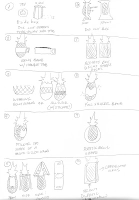
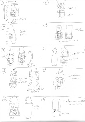
Sketches of Different Forms
My favorite form variations are 6, 12, 18, and 21. After further discussing it, number 6 would be the most successful form to apply to my concept.
Wordlist
Hawaii:
tropical
island
leis
flowers
luau
volcano
vacation destination
travel
Hawaiian shirts/ pattern
palm trees
beaches
white sand
crystal clear water
scuba diving
coral reefs
surfing
hula dance
hula skirt
fire pits/ outdoor cookouts
great weather
Hawaiian music
ukulele
swimsuits/ bikinis
surfboards
swim trunks
Beach Boys
island chains
airport travel
boats
mountainside
winding roads
sunglasses
nose sunscreen/lotion
hotels/ luggage
outdoor parties
warm/hot weather
bright colors
sunny/clear skies
Pearl Harbor
pineapples/coconuts
piña coladas
coconut drinks with umbrella
beautiful sunsets
cruises/ cruise ships
Inspirational Images
As I was looking into the region of Hawaii some more, I thought about travel posters. Travel posters are usually the first images that we associate with foreign destinations so I thought this would be a neat idea for packaging my pineapples. To eat a pineapple is to go on a voyage to a far away destination.
 |
| Image Source: http://www.squadronposters.com/product/k-bay-vpu-2/ |
 |
| Image Source: https://www.pinterest.com/pin/173670129357769453/ |
 |
 |
| Image Source: https://www.pinterest.com/explore/vintage-hawaii/ |
 |
| Image Source: https://www.flickr.com/photos/paulmalon/8195550811 |
 |
| Image Source: http://ovationdmc.com/dmc-network-announces-new-hawaii-affiliate/ |
 |
| Image Source: http://www.surfclinics.com/oahu-surf-lessons-hawaii/lessons/ |
 |
| Image Source: http://thepointsguy.com/category/destinations/hawaii-2/ |
 |
| Image Source: http://eskipaper.com/honolulu-hawaii.html#gal_post_21538_honolulu-hawaii-1.jpg |
 |
| Image Source: http://www.landsofamerica.com/Hawaii/all-land/ |
Mood Board
Paper Prototype Template / Images
Thinking logistically about the differing weight distributions and shape of the pineapple I felt that packaging that allowed the pineapple to sit naturally and without it resting on the packaging for support would be the most effective. To have it at an angle or in any way that could disturb the weight balance would cause issues once displayed. Therefore I have it resting flat on the bottom. I could have added a boxed bottom that would raise the pineapple, but I wanted to keep the amount of cardboard used as minimal as possible yet maintaining my concept.
I also included a band that would attach on the inside of the cardboard and wrap around the pineapple for support. I am still deciding if I should make it plastic, a sticker, or a thin cardboard paper.
This concept could be simplified further by using a single, double-side printed, die-cut tag that would still fit on the pineapple, but held on with a piece of elastic. This would be easier assembly and more cost efficient while still adhering to the concept.
After careful consideration, I decided to go with less packaging. While my original protoype, I felt, was very strong in regard to my concept it would be costly and awkward in production. Given the radical contour differences between pineapples, the shape of the opening would be awkward in most circumstances. As far as shipping goes, the extra packaging would cut down on the number of units per container and raise shipping costs. That and the cost of production alone of the packing cannot be justified by the scale of the design. With all of these things in mind I finally concluded on less packaging, while trying to maintain my concept.
I decided upon a simple tag that will be held in place by a small elastic band for easy removal. The tag will have a detachable recipe card, while the remainder of the tag could be folded and used as a bookmark.
Design Process
I started with a quick mock-up of what the design might look like with my pineapple. This of course will evolve, but for now it gives me a good idea of the placement of my design elements and how I should proceed.

Final Layout

