Saturday, April 23, 2016

Assignment 06 / Emotion

How do you go about packaging an emotion?
Can it be a visual representation of an emotion?
Can it illicit the emotion from the viewer?

My emotion for this project is FEAR.


Word list

Fear:

stifling
debilitating
fight or flight
dark/ darkness
black
lurking in shadows
fear of the unknown 
fright
dune: fear is the mind killer
nothing to fear but fear itself
irrational fear (phobia)
psychological fear vs. physical harm
fear street (books)
anxious
afraid
terrified
fear is a cage
overcoming fear
fear of water
fear of heights
fear of spiders
fear of small spaces
emotional/professional fears
fear of loss
fear of the future
locked
gripped
trapped
pinned down
dripping with fear


What is fear?

According to Wikipedia:

"Fear is a feeling induced by perceived danger or threat that occurs in certain types of organisms, which causes a change in metabolic and organ functions and ultimately a change in behavior, such as fleeing, hiding or freezing from perceived traumatic events.

Fear in human beings may occur in response to a specific stimulus occurring in the present, or in anticipation or expectation of a future threat perceived as a risk to body or life. The fear response arises from the perception of danger leading to confrontation with or escape from/avoiding the threat (also known as the fight-or-flight response), which in extreme cases of fear (horror and terror) can be a freeze response or paralysis.

In humans and animals, fear is modulated by the process of cognition and learning. Thus fear is judged as rational or appropriate and irrational or inappropriate. An irrational fear is called a phobia."


Images


Image Source: http://karlamclaren.com/emotional-vocabulary-page/

Image Source: http://justtonyab.com/tag/fear/

Image Source: http://jimpwasere.com/fear/
 
Package Ideas

Image Source: http://shessmart.com
Image Source: http://www.vecteezy.com
Image Source: http://www.123rf.com
Image Source: http://www.birdcagedesign.com
Image Source: http://www.studiomethode.com
Image Source: http://pixhder.com
Sketches


Package Materials

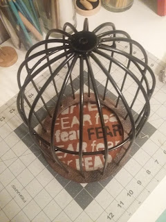
For this project, I will be crafting a cage with no door. It will be a domed cage constructed out of light weight metal wire and a wooden base. To add texture, I will add a layer of textured spray paint before adding the final color, a glossy black.

After doing some color/material testing, I have decided to have the bars of the cage a gloss black, while the base of the cage is a hammered copper. I am going to try and make it appear as if the bars are melting or dripping to relate to the expression "dripping with fear". I think this would be a nice visual element as well as further push the concept of fear. On the inside base of the cage I am going to stencil the word "fear" several times, only emphasizing one of them. This is to symbolize the myriad of different fears and how some overshadow others within ourselves.


Product Application

Once I started building my package, I started to think how this could be applied to an actual product. Going back to my word list I made the connection that "pinned down" could refer to push pins. It wasn't, however, until I had nearly completed my first design that I thought about applying it in this way and I could not modify or reproduce another one in the time frame. But with modifications this could easily be used as a unique marketing package for push pins.


Mood Board


Design Process

My initial design was a cage with the word "fear" reprinted on the bottom.  I made a stencil and applied it to the bottom.


After I completed the cage, I felt that it needed an extra element. I created a hang tag that played off of the idea of "fight or flight" by using imagery corresponding to that and made it double-sided.

I really liked this concept and felt that it was a subtle approach to naming "fear" without having it printed all over the bottom of my cage. It was then that I decided to remove the words from the cage itself and apply it to the hang tag. I did this by creating a smaller secondary tag that was in reverse values as the primary that simply stated "FEAR". I feel that this design is more successful.

Final Product Images and Templates


Tuesday, April 12, 2016

Assignment 05 / Technology

Package design for a thumb drive storage device.

Research Images

Technology based imagery. I really liked the color palettes and overall look of the below photos.

Image Source:http://www.whitecase.com/law/industries/technology

Image Source: http://kenstonlocal.org/kenston/technology/


Inspirational Images/ Packaging

 Packaging

Image Source: http://smokingdesigners.com/top-gadget-month-gadget-flow/

Image Source: http://www.usbpackaging.net/electronic-device-set-package/lapka_1/

Image Source: http://www.leifshop.com/products/echo-flash-drive

Tetris/ Rubix Cube

Based upon the images above, my initial idea was to create a cube that had the illusion of being a rubix cube by using die lines and folds for texture. The thumb drive would be suspended in the middle using plastic formed to shape and viewable through a die cut on two opposing sides. While I didn't see anything like my idea, the rubix cube had already been done. In fact, I had a hard time coming up with a idea that hadn't already been done in some variation. So if I am to pursue this idea I definitely need to make sure that it sets itself apart from the crowd.


Image Source: http://www.idownloadblog.com/2013/05/30/tetris-blitz-ios-revie/
Image Source: http://www.livescience.com/3189-tetris-game-quells-bad-flashbacks.html


 Lollipop


After creating my word lists and looking at different packaging ideas I settled upon the idea of candy, more specifically lollipops/ suckers. They are bright and colorful and I could integrate the usb drive into the packaging without making the usb drive itself a novelty item.

 Revisiting my lollipop idea, I could apply my inspirational images into it further by having the usb drive act as the lollipop stick and incorporate the color into the lollipop.


Image Source: http://www.ufunk.net/en/food/death-star-lollipops/
Image Source: http://www.indoorcycleinstructor.com/


Light Bulb

Thinking even further about different shapes and how I could make the lollipop more interesting, light bulbs came to mind. Then I thought that maybe that would be a better approach. A plastic light bulb that houses the flash drive and is secured in the packaging by the bottom fixture (detachable and not a part of the whole). "Waiting for your next bright idea" popped into my head to tie it all together with a yellow colored usb drive.


Word lists


thumb drive:

flash drive
storage (digital)
pocket
carry with you
portable
memory backup/ protection
aluminum
light weight
cute/ fun characters
fast
reliable
universal (serial bus)
small/ tiny
rectangle
small size/ big storage
Thumbelina
Tom Thumb
hand held
accessory
PNY/ Sandisk/ Gorilla

storage device:

container
cloud storage
internet
google drive/ cloud/ dropbox
rental storage
key code protected
protection
save for later
hard drives


Sketches


Template

Based on my candy idea, I created two different templates. I started off with a circular template that would have the flash drive extend out of the bottom (like the stick on a lollipop). The only drawback to this design is the difficulty in folding a curved edge. If I created an angular design approach I think this would be feasible. 

After the initial difficulties with the first design I created a package that was in the shape of a wrapped piece of candy. At first I thought about actually wrapping the flash drive in a cellophane type of paper as if it were the candy itself. I thought that this design might not be acceptable for this class project, so I created the second template below. 


--------------------------------------------------------------------------


New Direction / Team Music

Creating a flash drive that is music oriented. It will have a built in audio(AUX) port for listening to music and the company will be Soundcloud. While this flash drive will function like a standard flash drive, it will be primarily geared toward the music industry as a means of promotion and general sales. Each flash drive could be customized and loaded with an album. The brand of the flash drive will be Soundcloud which an online music service.


Inspirational Images


Image Source: http://bravethewoods.com/category/illustration/
Image Source: http://www.123rf.com/photo_20494085
Image Source: http://www.123rf.com/photo_7266813


Sketches


Mood Board


Template


Type Treatments


Design Process

Logo Design

Knowing that we were branding our device through Soundcloud, I began experimenting with some logo designs.  The knockout white logo was done by Tanner who was playing off of the spotlight motif from our mood board. We decided to keep our color scheme on par with Soundcloud. The bright orange is very eye-catching and sleek against white.


After discussing having the die cut hole for the hanging peg as being a silhouette of the Soundcloud logo, we changed it to the UPC. The UPC seemed more appropriate because of the vertical lines already present in the logo design itself.


For our main design element, we wanted a hand drawn sketch. After doing some image searching, I thought about doing a downtown skyline. Thinking about bands touring around the country, they visit different cities. The illustration below is an illustration of downtown Tulsa, Oklahoma. The image includes the BOK Center which is a stadium/ concert venue that has become a recognizable icon of the city.
I then brought the image into Illustrator and turned it into vector art.

While clearing out selective areas of white, which I had set against a bright yellow background, I really liked the look and feel of the image.
In revisiting our inspirational images, and seeing photographs of the Tulsa skyline reflected on the river, I thought that maybe the same principle could be applied to out music graphics. The skyline could be reflected as a musical sound wave of colors. The first attempt is very playful and not very reminiscent of the desired image.


I then created a more structured approach that resembled audio waves.

Tanner began laying out everything on our template. Initially we were going to have the illustration wrap across all three planes. But then brought in a solid box which I feel adds a nice panel for our information. Originally it was going to be the entire back panel, but after some discussion we decided upon continuing the grid pattern and skyline peeking behind the color block.

After we finished the initial layout, I thought that we could change the colors and the city skyline for the various gigabyte storage types to create a series.


For the inside of the template (which will unfold to reveal the lanyard), Tanner had the brilliant idea of continuing the pattern on the inside and adding a little extra hidden underneath the contents.

 Lastly, our original idea of adding a lanyard would have the Soundcloud logo printed on the lanyard itself. Due to production limitations, we decided to add an insert into the plastic protector that usually accompanies lanyards. We would have the logo on the front and the instructions for operating the music function of the USB drive on the back. Originally the instructions were going to be included as a single sheet of paper inside of the box. By incorporating the instructions in this way we are making better use of the already designed lanyard and ensuring that the paper isn't immediately discarded.


Division of Labor


Tanner executed:
Came up with the initial concept, sketches, and word list
Applied the graphics to the template
Typeset all of the text on the package
Created the concept of the brushstroke and orange text block on the back
Designed and executed the interior of the package
Created the UPC barcode in Illustrator
Wrote the copy text
Crafted the custom USB flash drive in modeling clay
Crafted the plastic housing unit for the flash drive

Amanda(myself) executed:
Created the mood board
Prepared the template/prototype in Illustrator
Created the logo for Tour Pack
Came up with the concept for the background graphic elements and UPC
Designed and executed the background graphics
Designed and executed the lanyard graphical element and instructions
Crafted the final package and lanyard
Consulted on the final typesetting 
Took the final production images

Overall this was definitely a team effort. We worked closely to ensure that all ideas and concerns were addressed and resolved. We were able to bounce a lot of ideas off of each other that contributed to the final design of our product.


Final Design


Final Product Images